Cluizel — Global Rebranding
Overview
Transforming a 75-year-old industrial chocolate brand from Normandy, primarily known in the B2B market, into a Parisian maison of fine chocolate. Our goal was to position them as a major player in the competitive landscape of luxury chocolate makers in the B2C market.
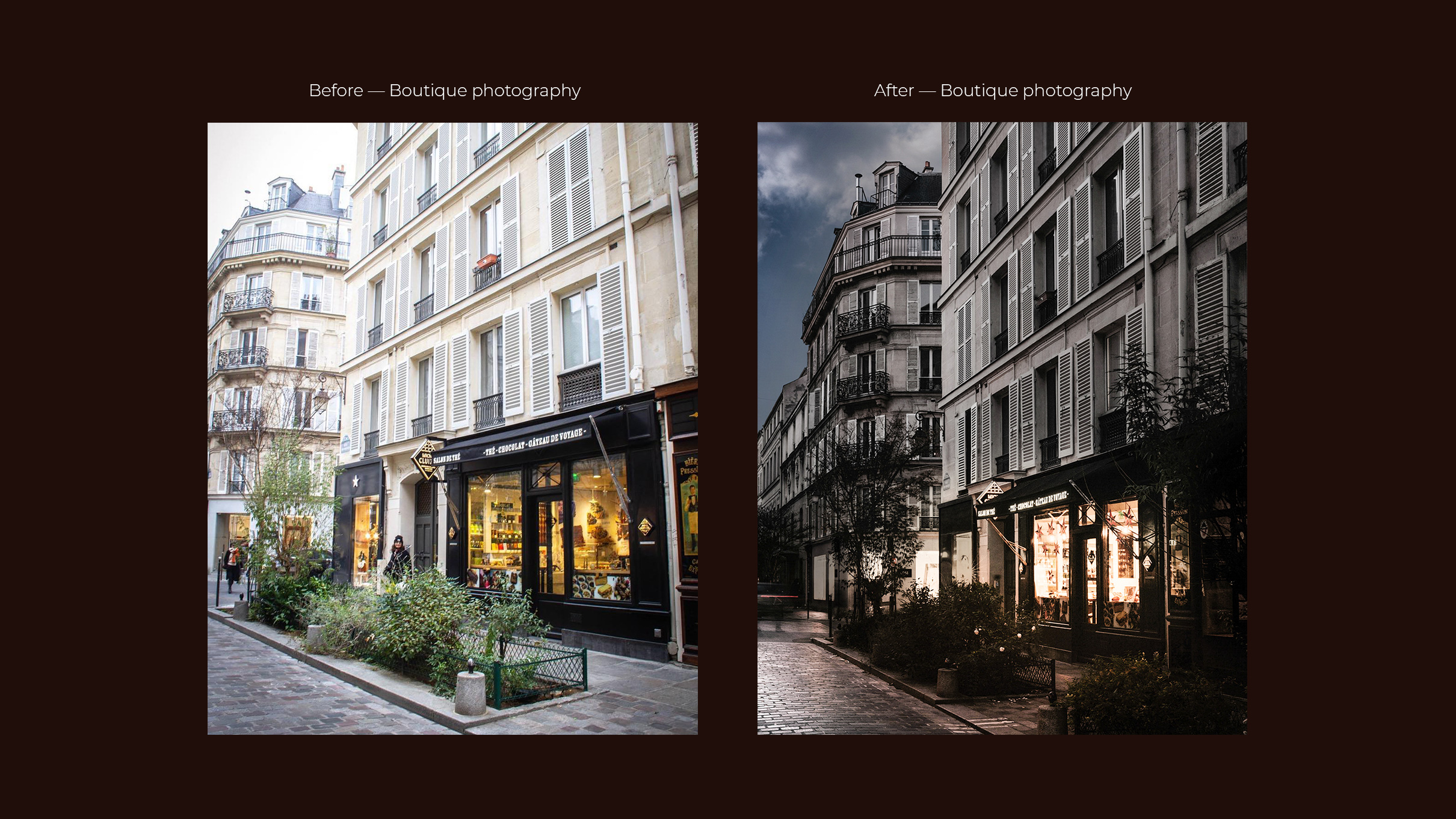
Undertaking a total branding overhaul, we've crafted a new brand image and marketing strategies. This involved developing a new brand platform, introducing a fresh logo and art directed the entire redesign process – from packaging and retail stores to their website, social media, product photography and videography. The final transformation delivered new brand guidelines with a new look and feel, tone of voice, activation ideas, social playbook and influencer guidelines.
Role - Creative Direction
Brand Strategy Development
Brand Guidelines
Art Direction (Logo, Typography, Packaging, Photography, Videography, Styling, Retail Design)
Social Strategy
Social Playbook
Concept Development
Graphic Design
Production + Post Oversight
Team Management
Client Management
Project Lead
Project
Brand Development
Digital Design
Brand positioning
The brand platform is anchored in 3 core values: passion, tradition and authenticity. Our task was to effectively convey these values and craft a brand personality that resonates as elegant, uncompromising and compelling, targeting the luxury chocolate market and consumers unfamiliar with the brand.
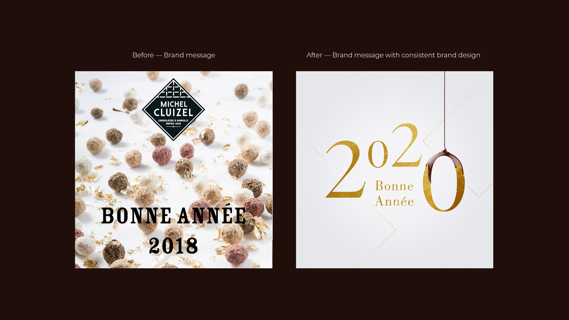
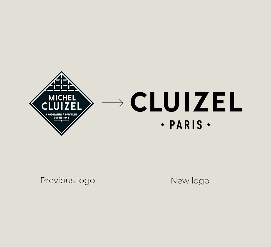
The logo was streamlined for a clean, modern and minimalist look, ensuring its adaptability across various channels – from website and marketing materials to trade shows and packaging. The original diamond shape was retained as a graphic element, creating a visual link to the brand's heritage.
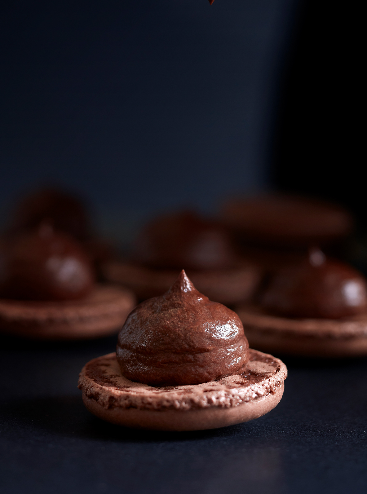
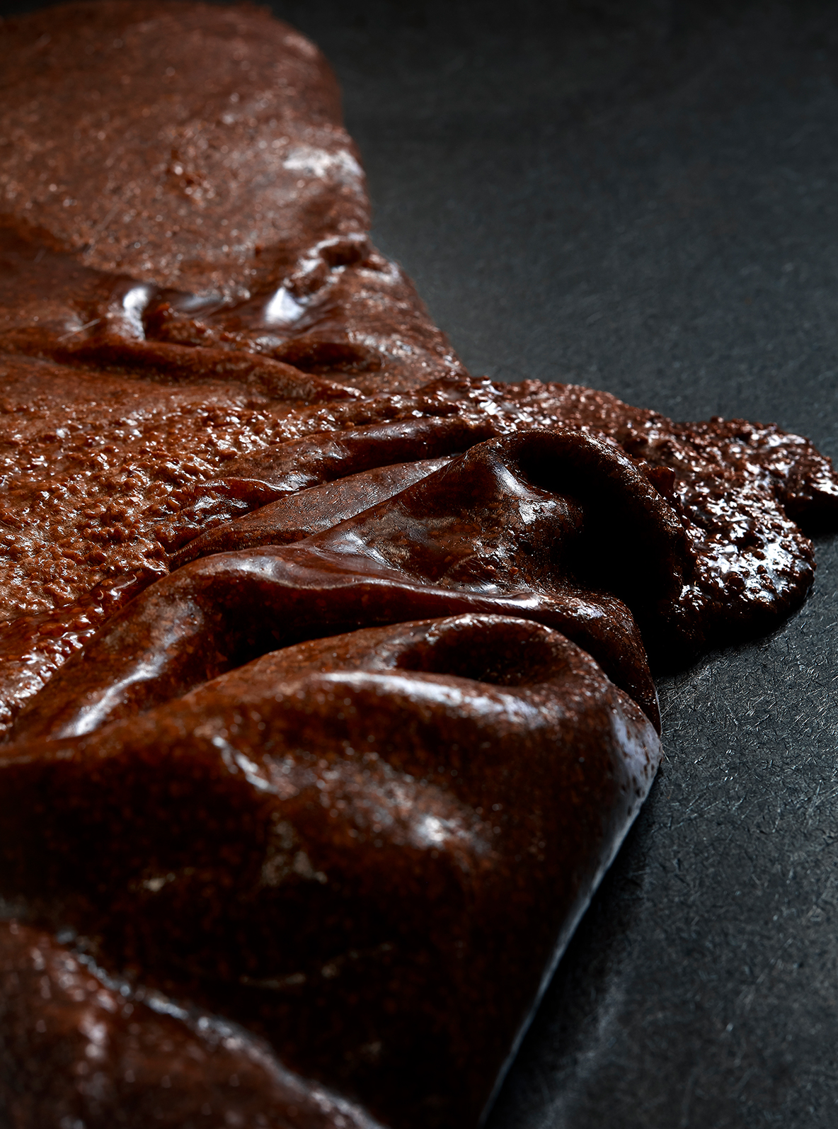
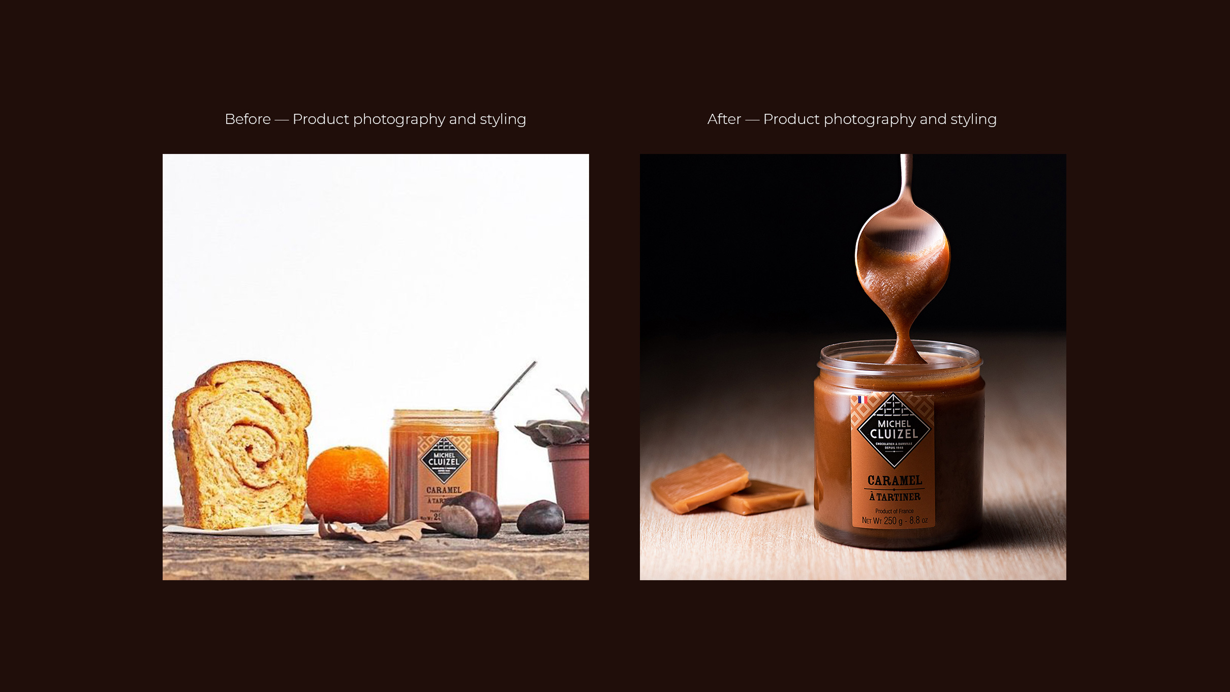
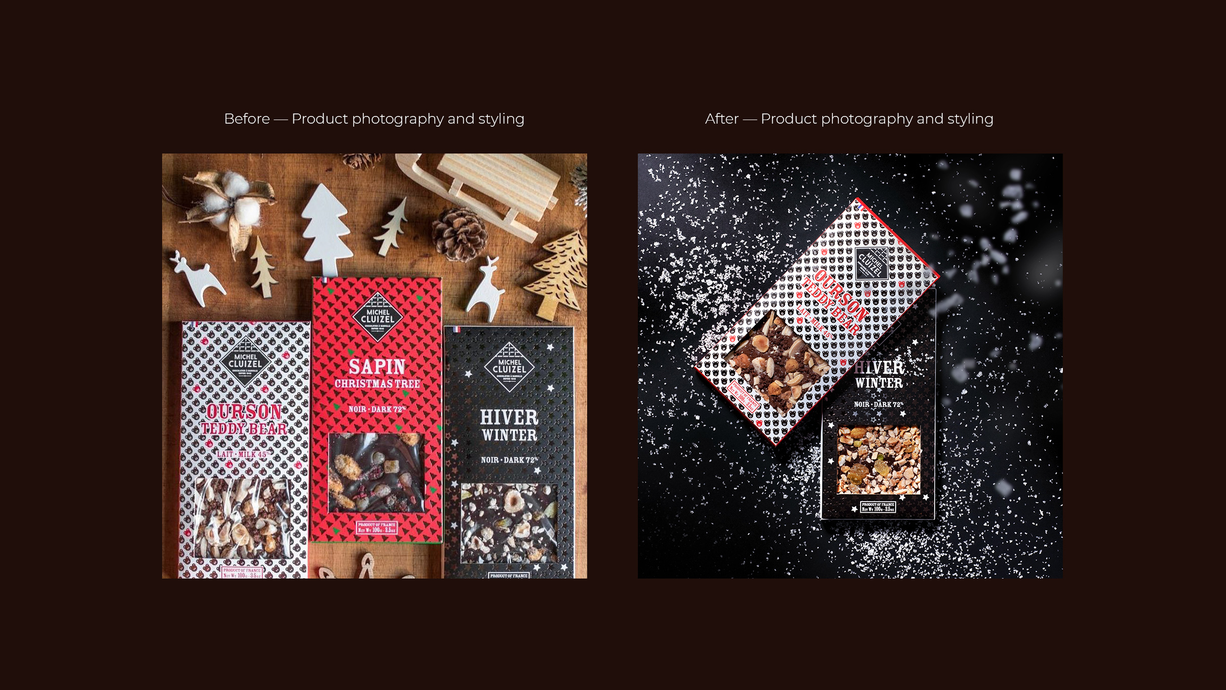
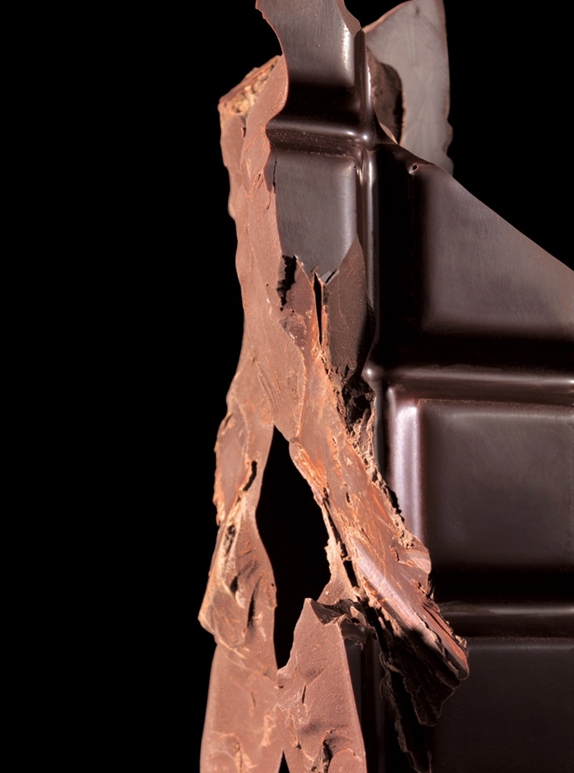
Photography Art Direction — Product
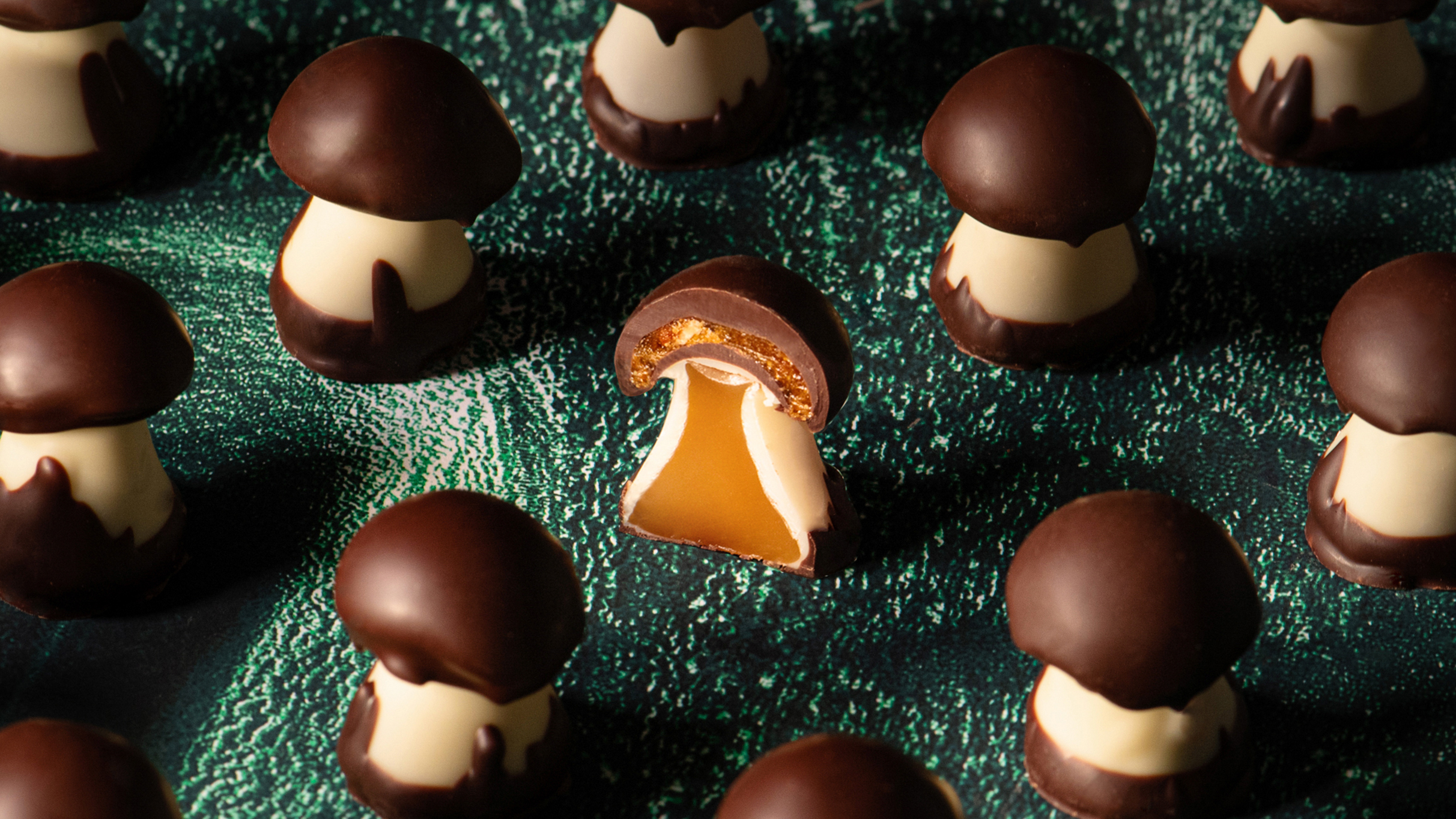
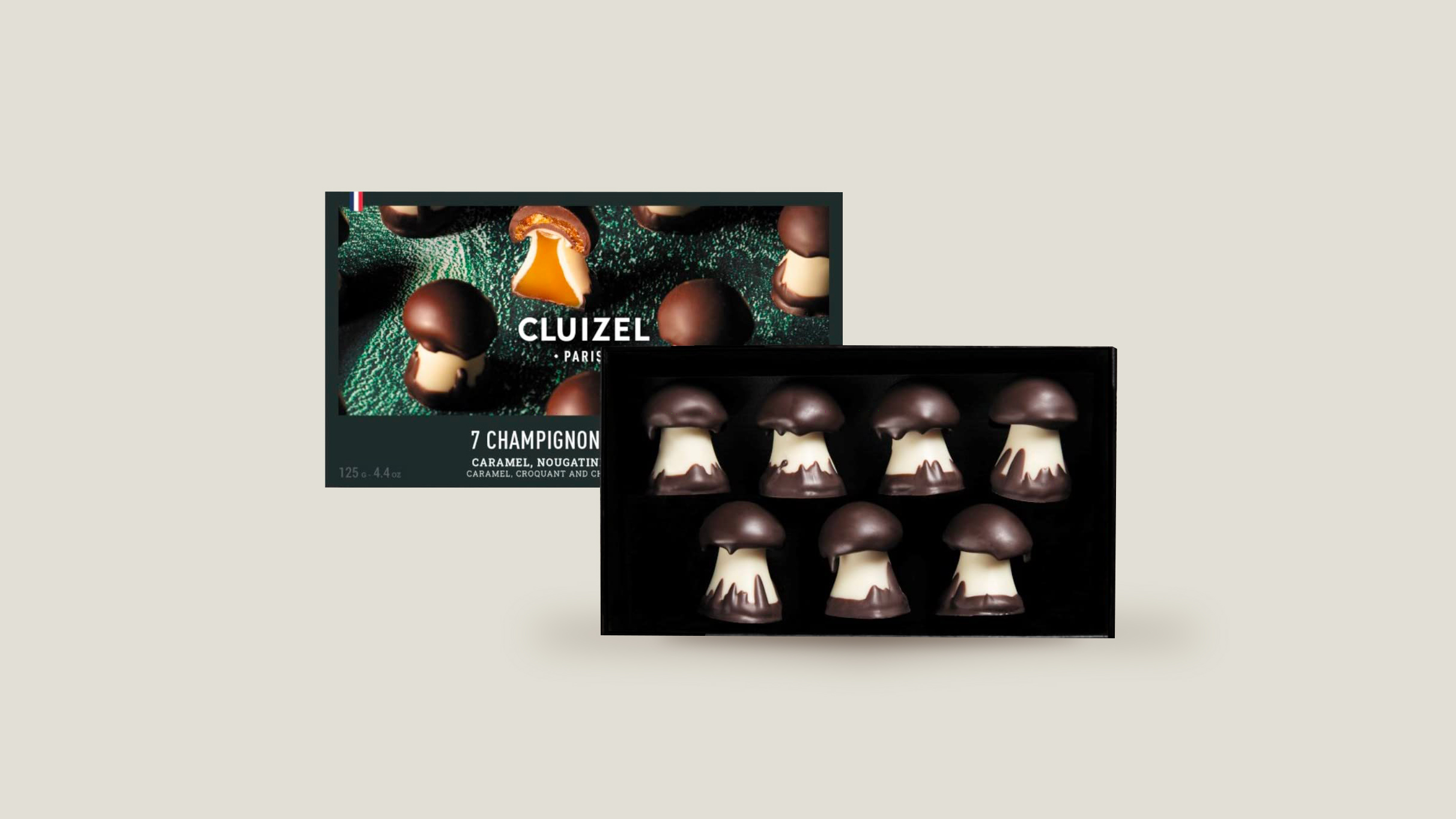
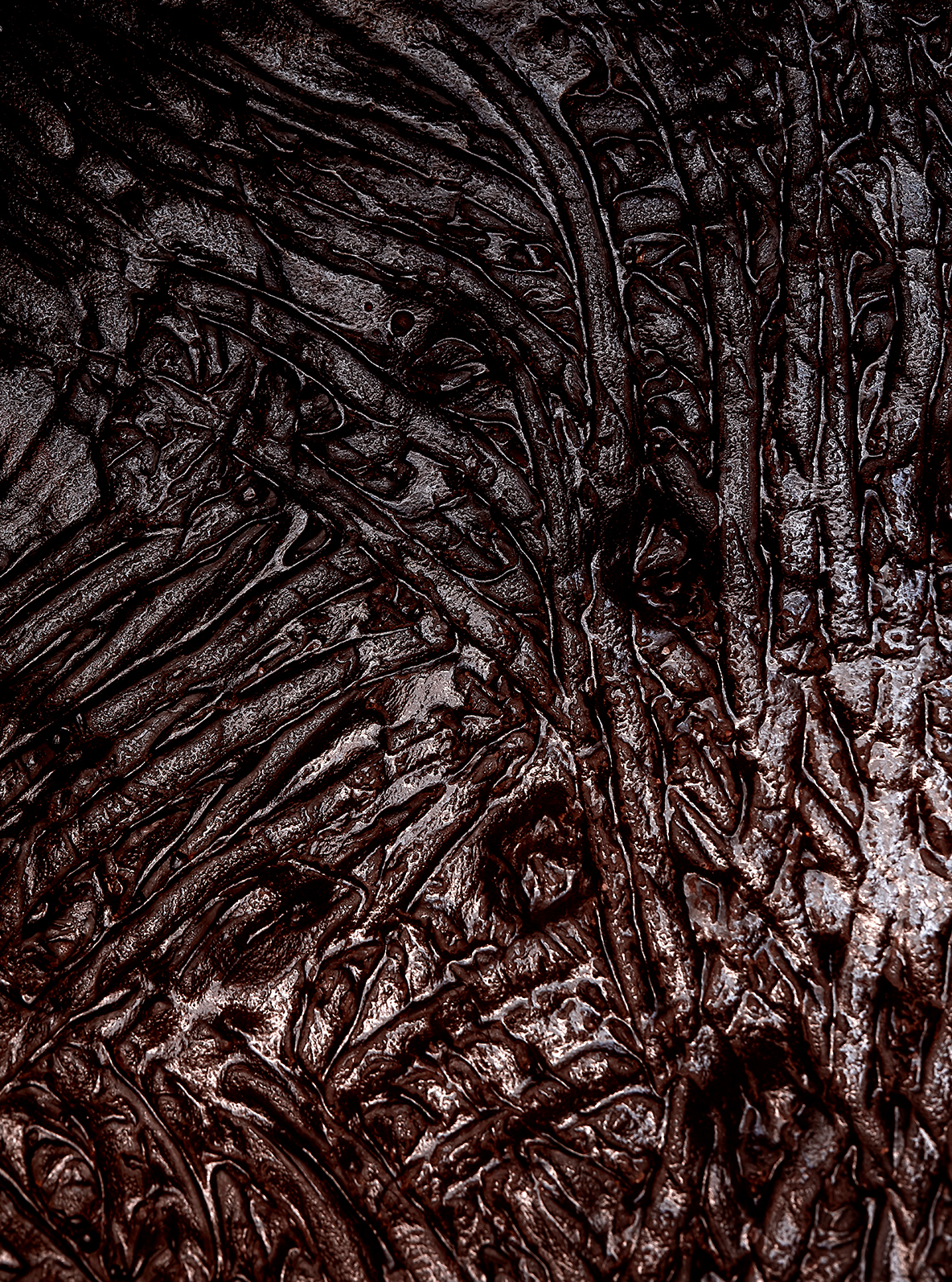
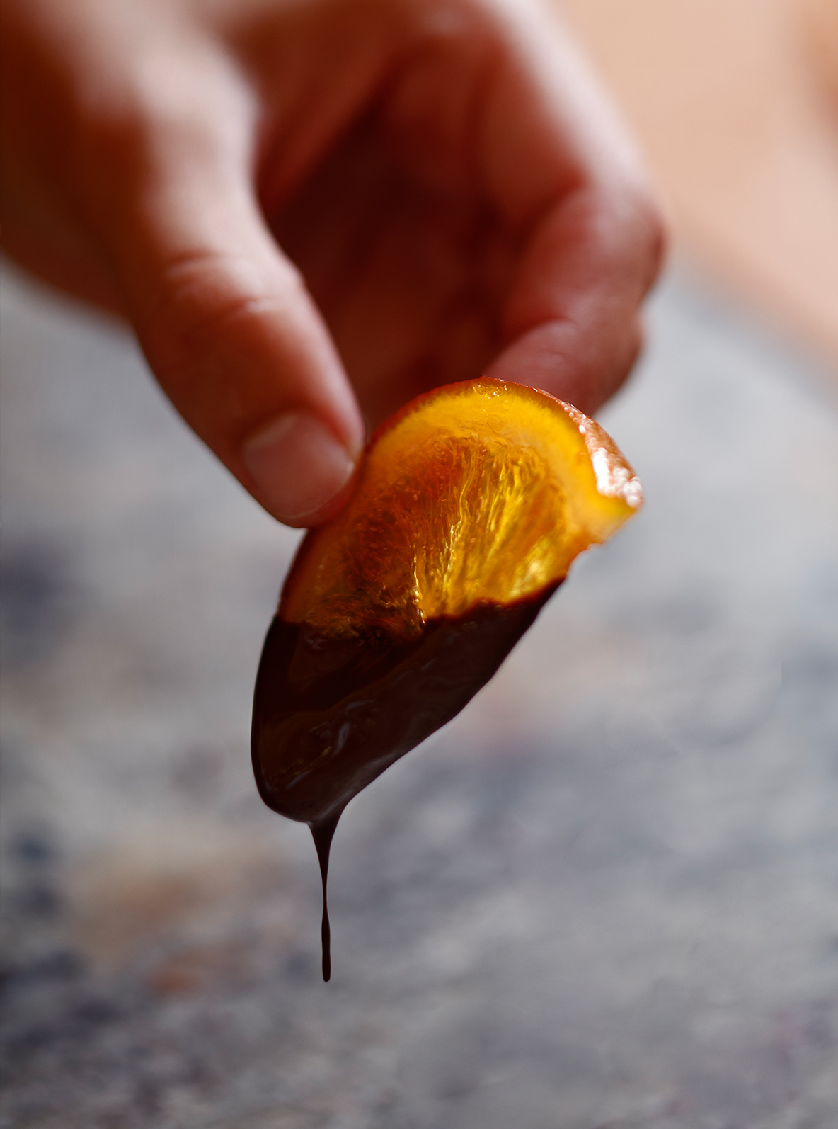
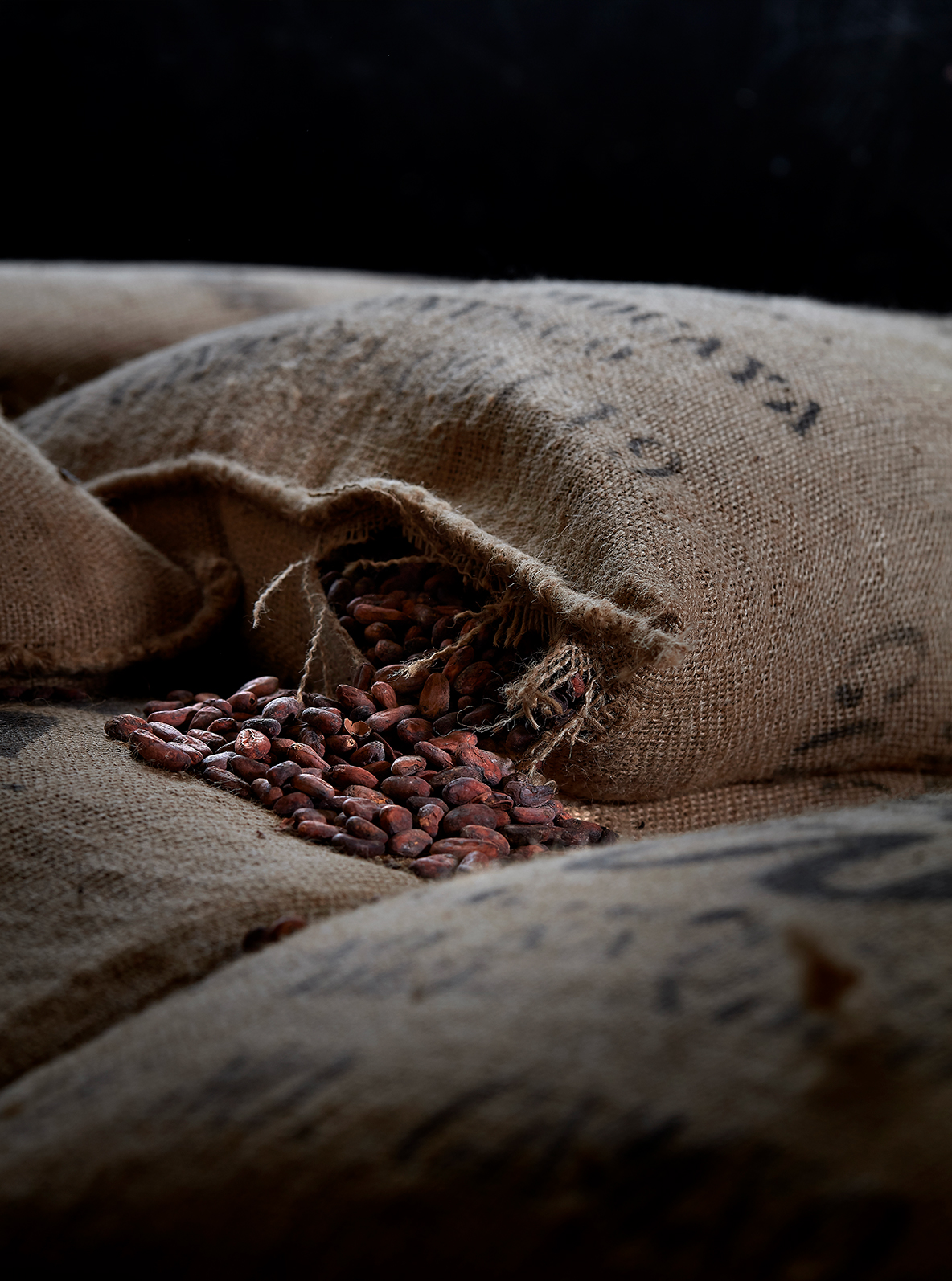
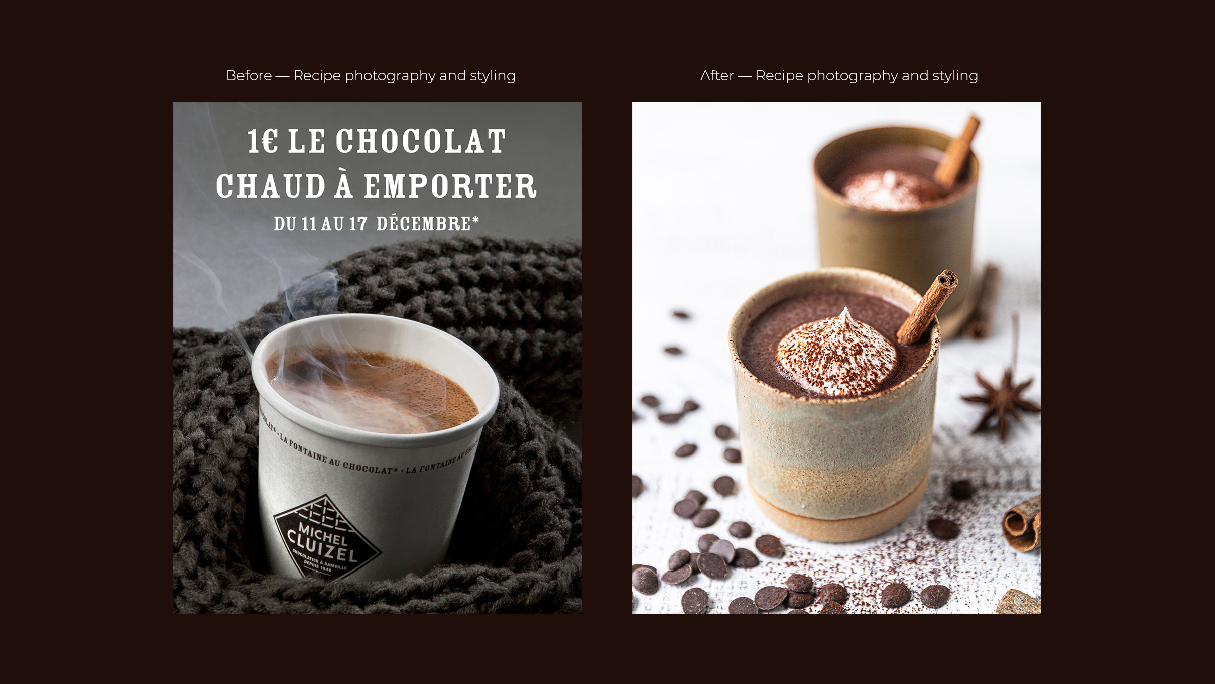
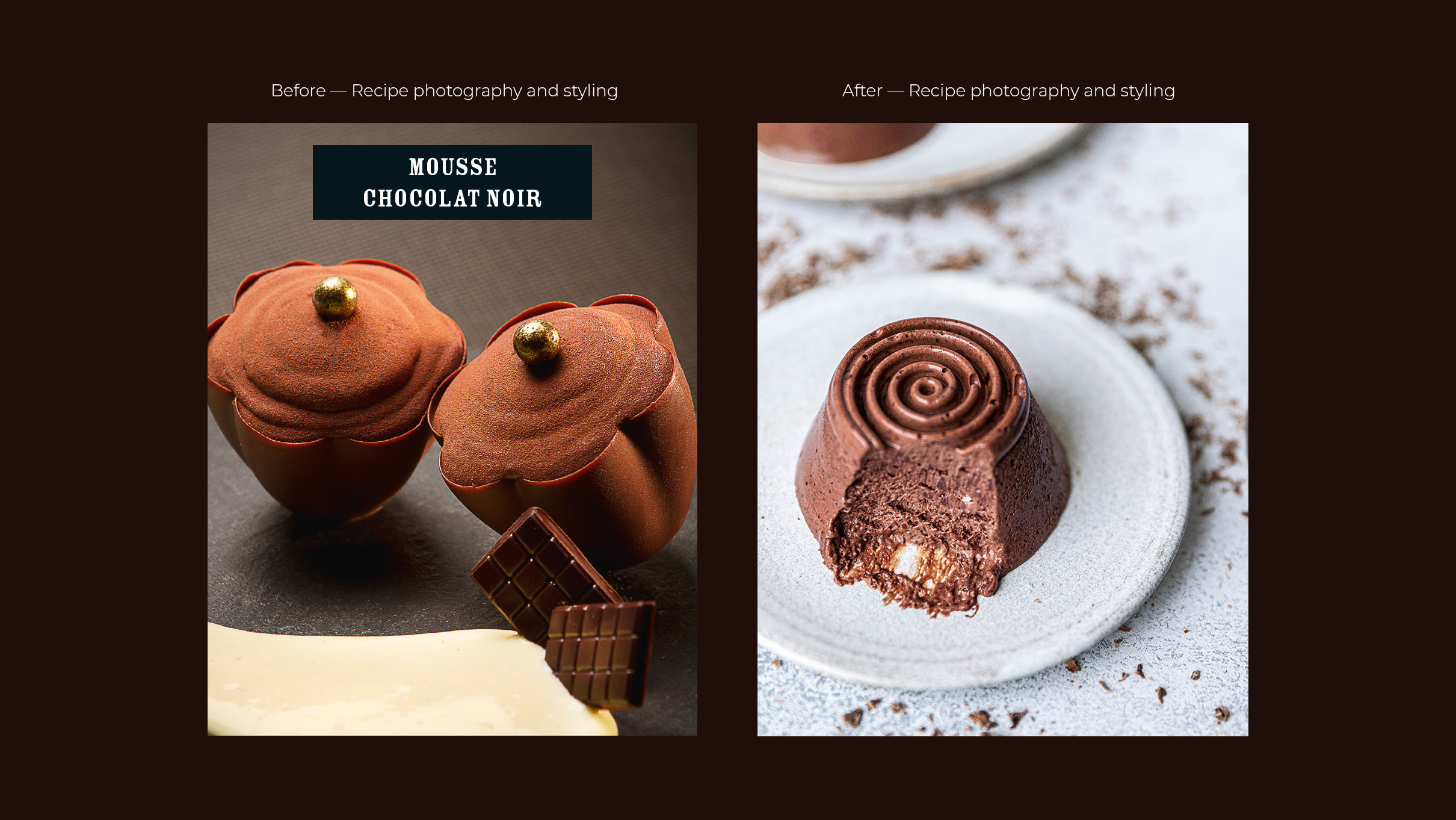
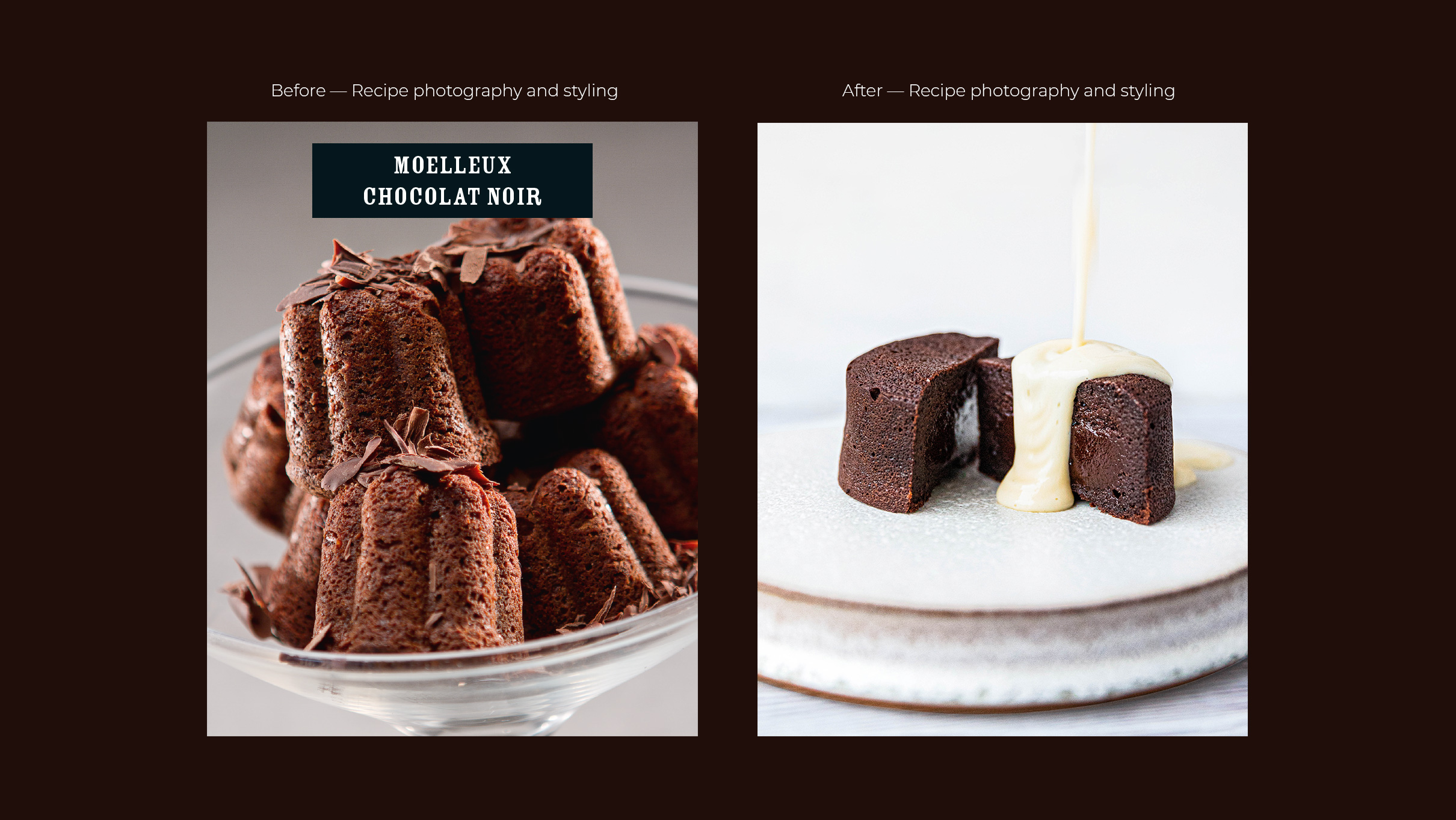
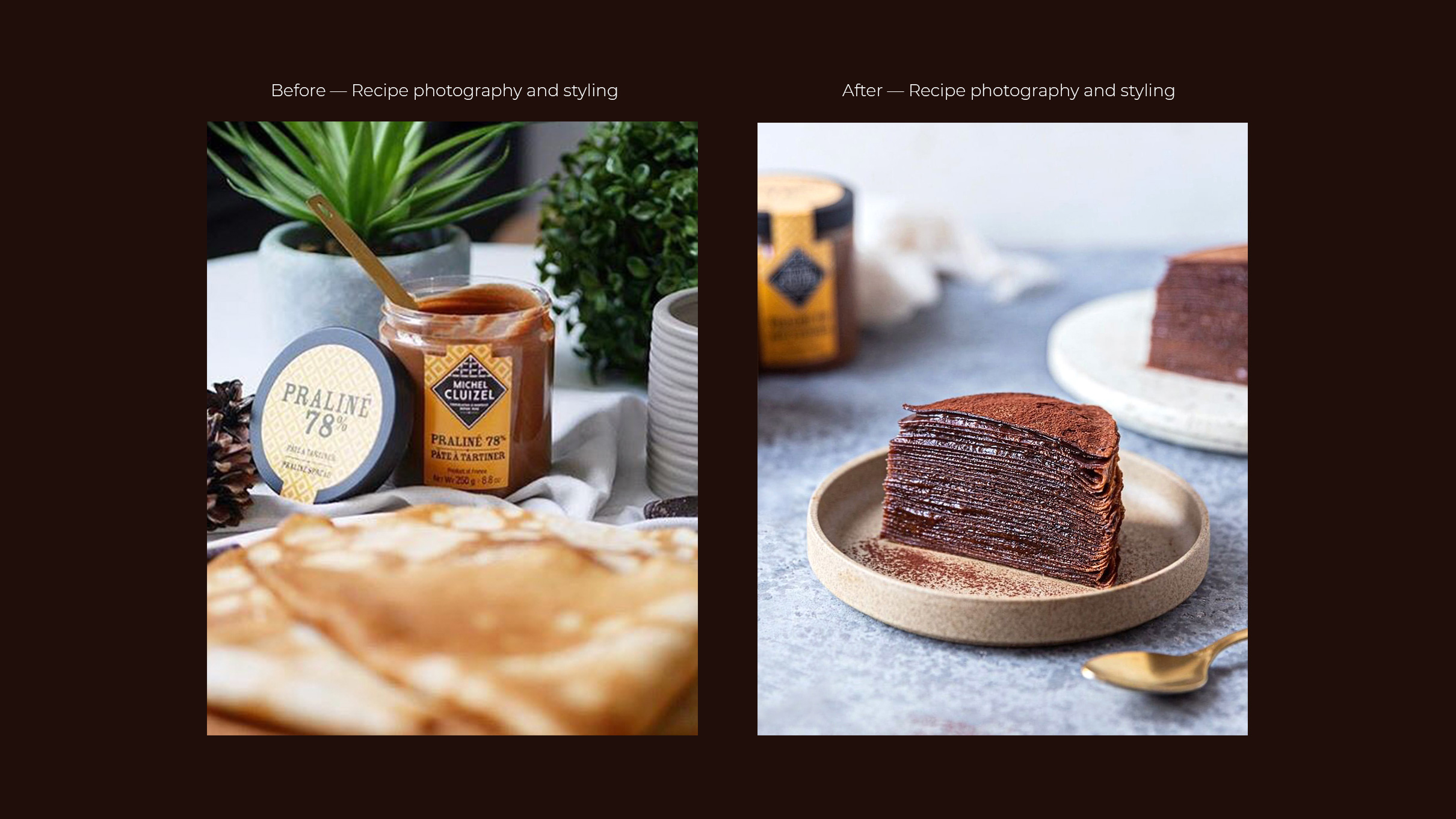
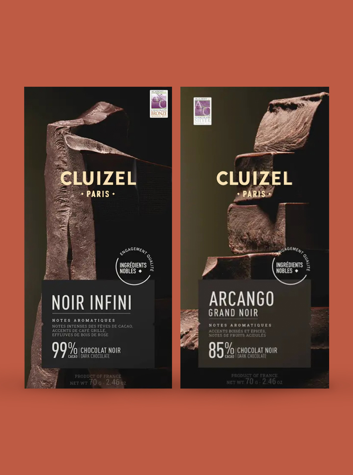
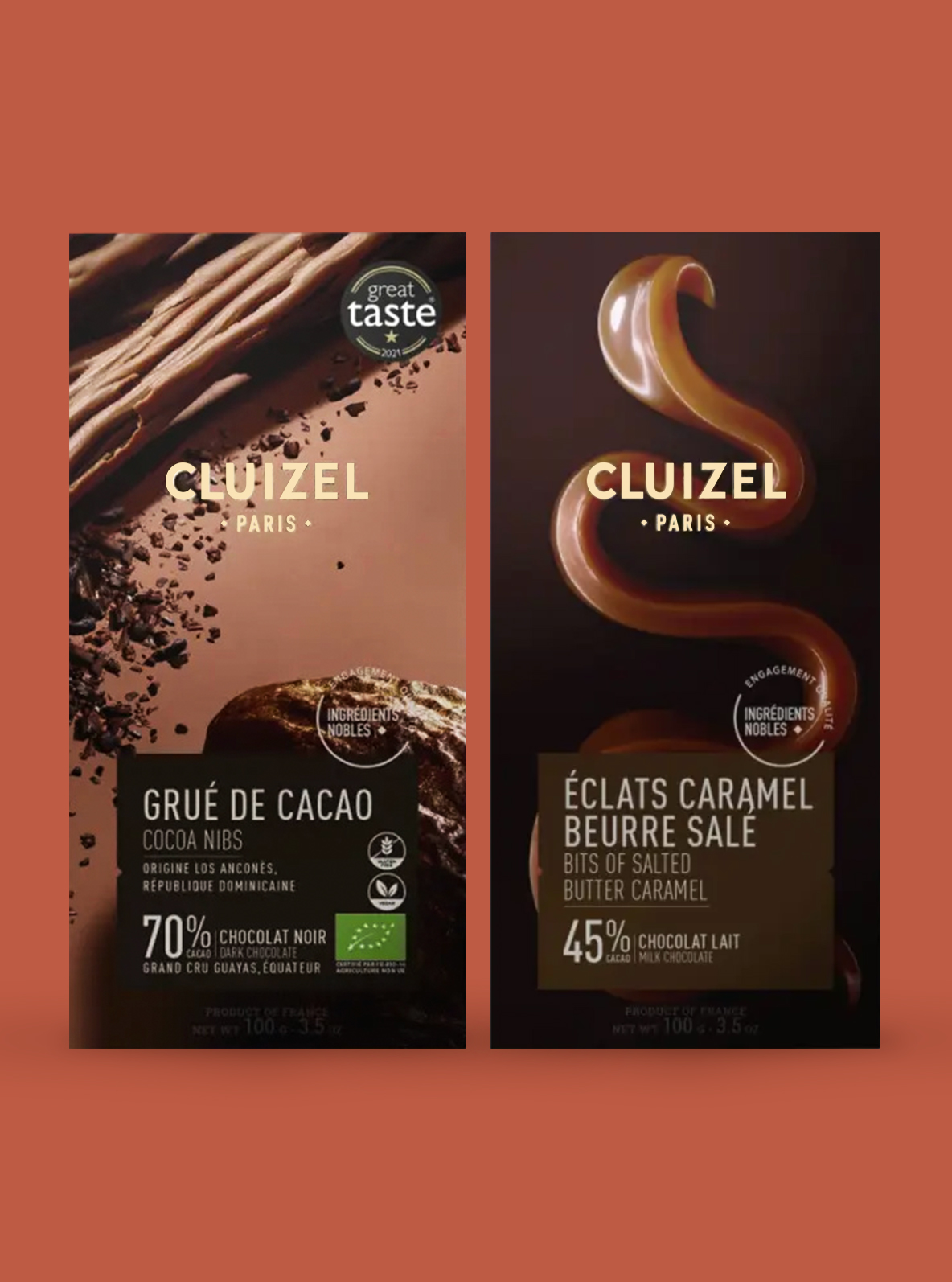
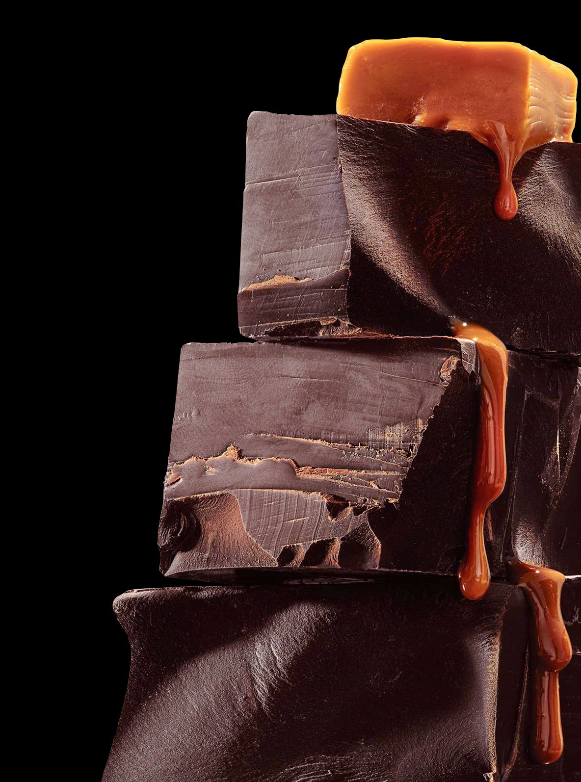
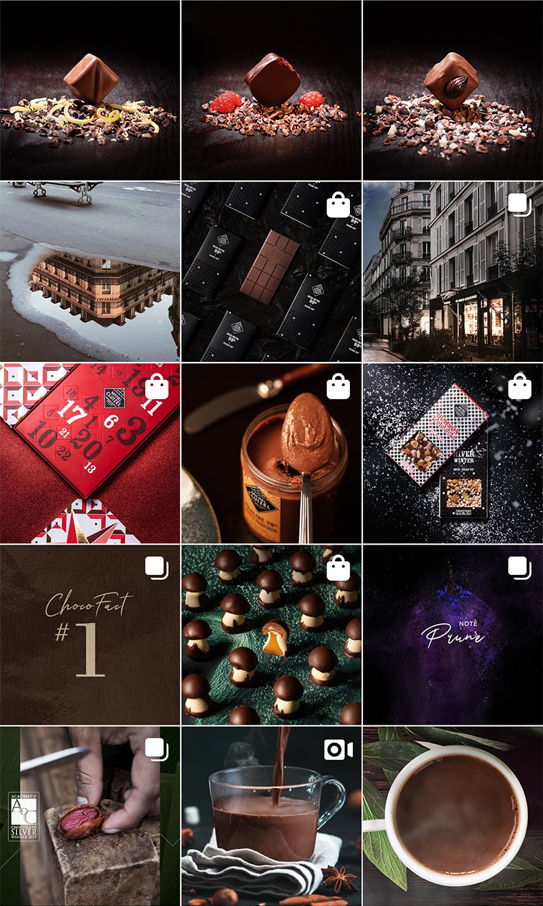
Cluizel consistently prides itself on responsibly sourcing natural ingredients. The sleek and elegant art direction aims to highlight the essence of nature and craft in an immersive and cinematic way, showcasing premium quality. Beyond this, the unique macro shots of chocolate set the packaging apart, ensuring the product is instantly recognizable and desirable for consumers seeking a high-quality experience with distinctive and authentic products.
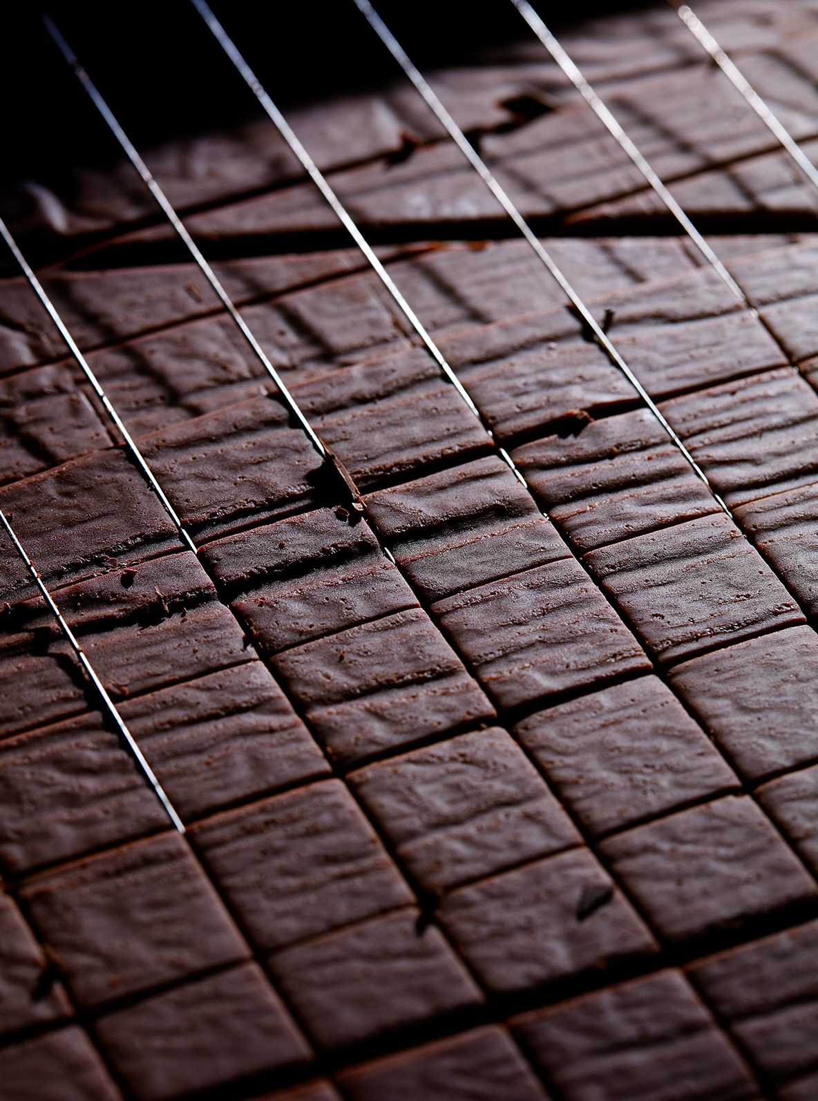
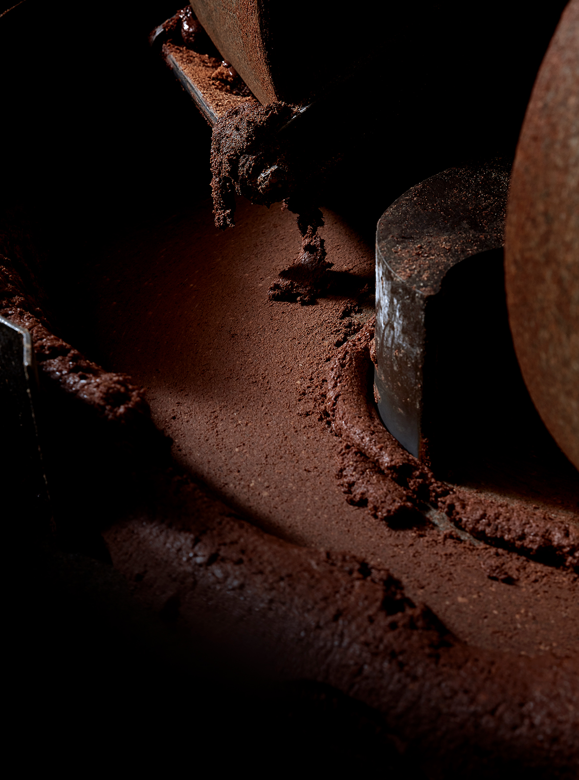
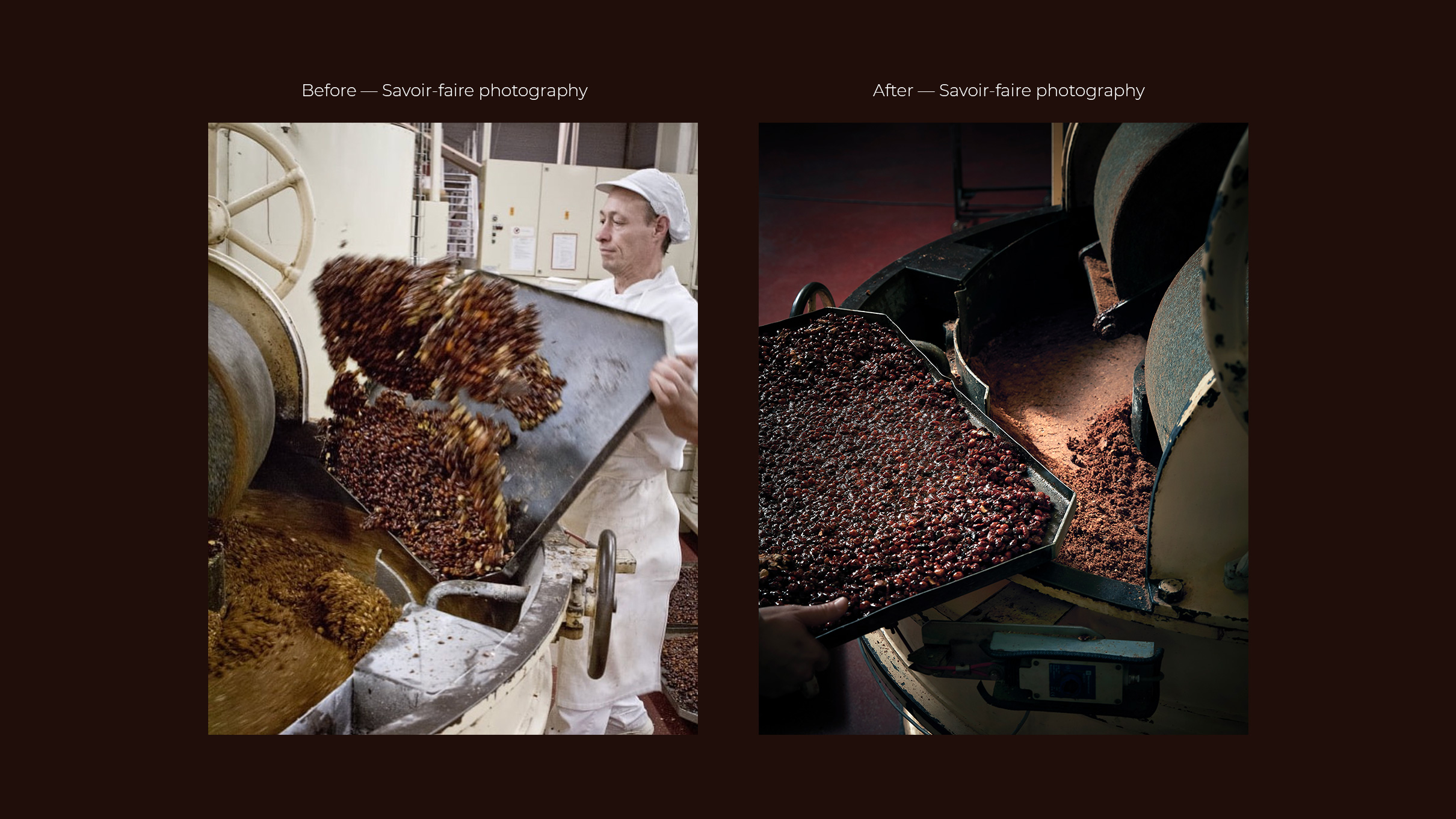
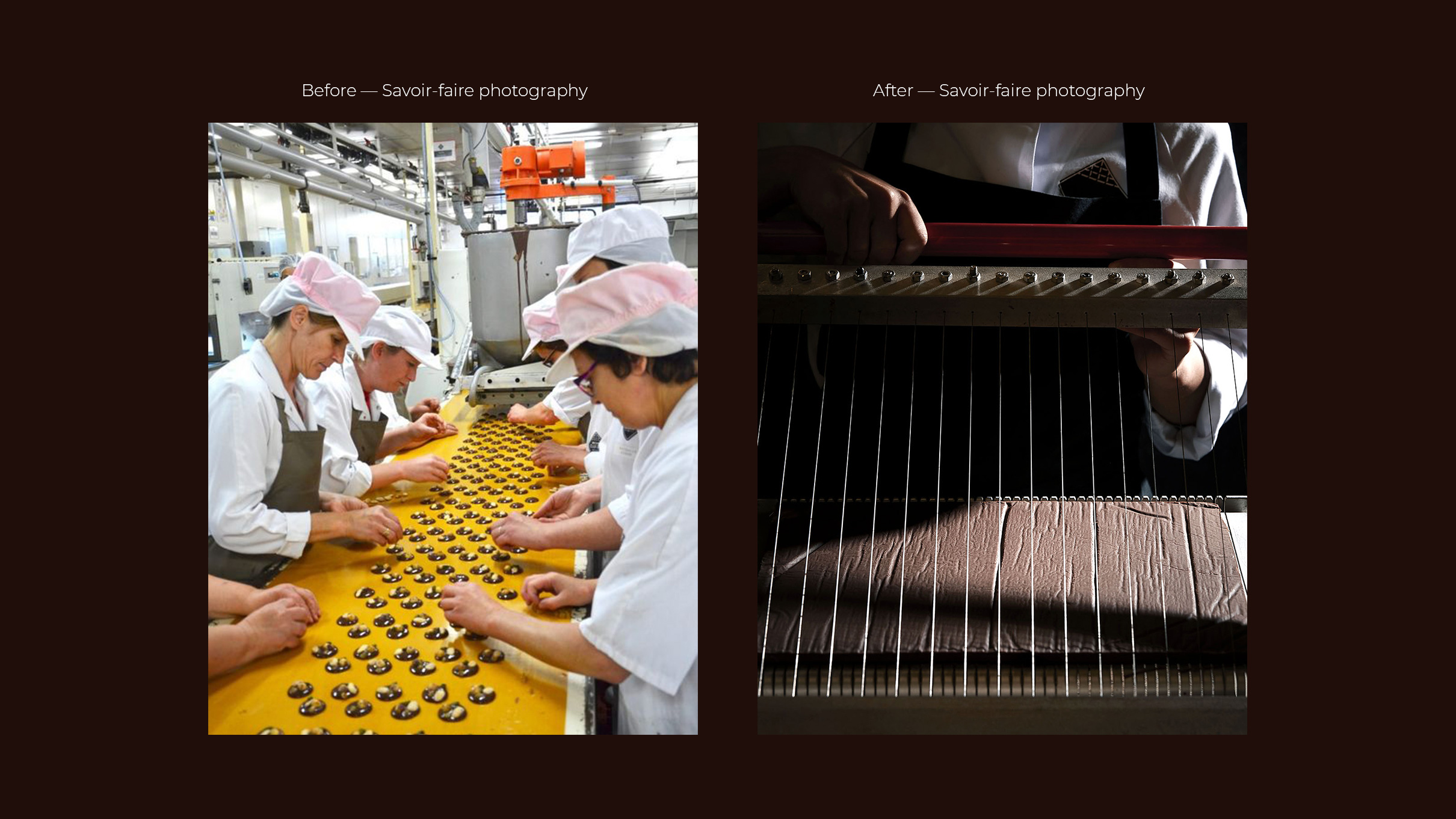
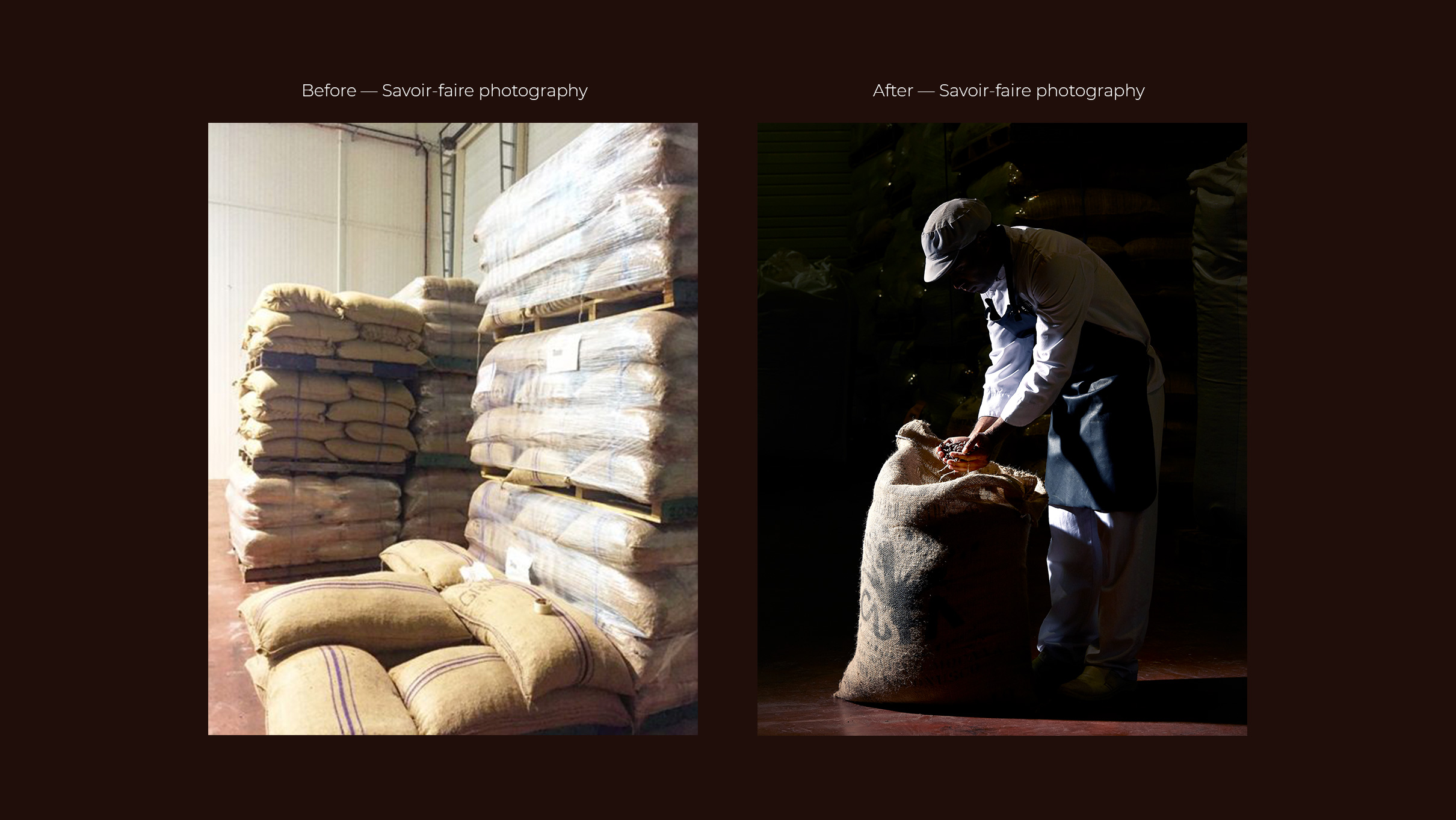
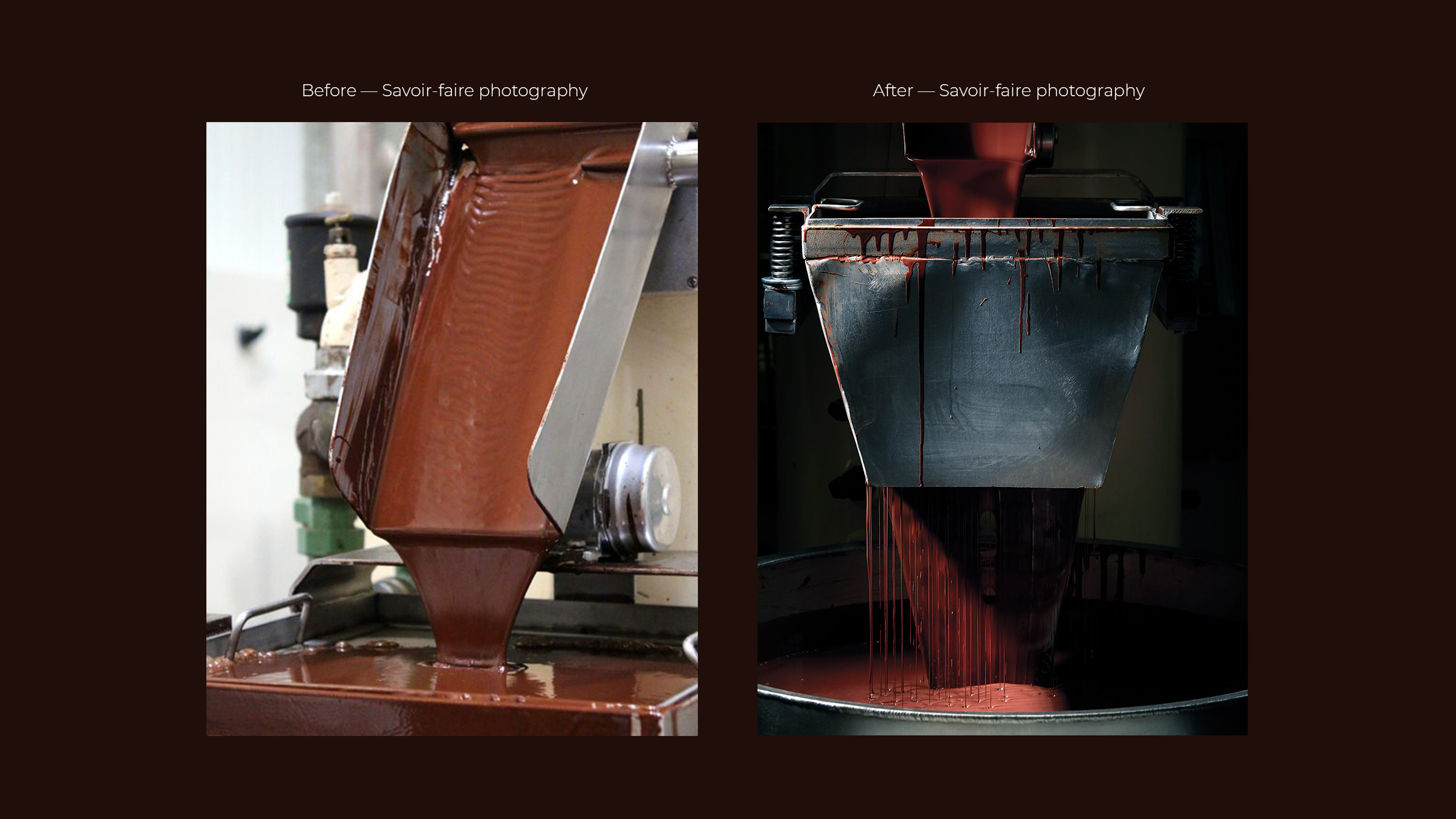
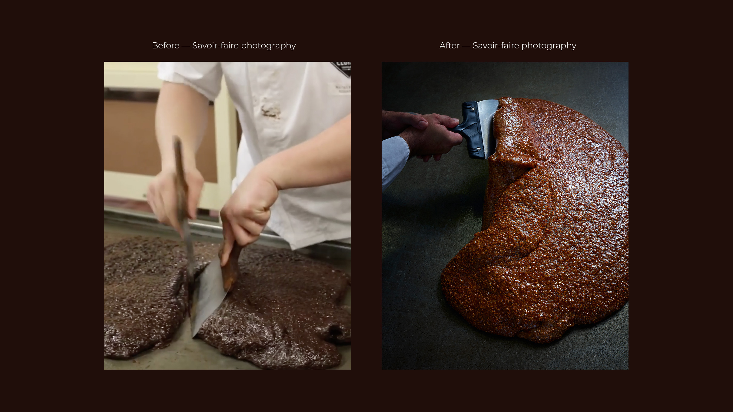
Photography Art Direction — Brand Heritage
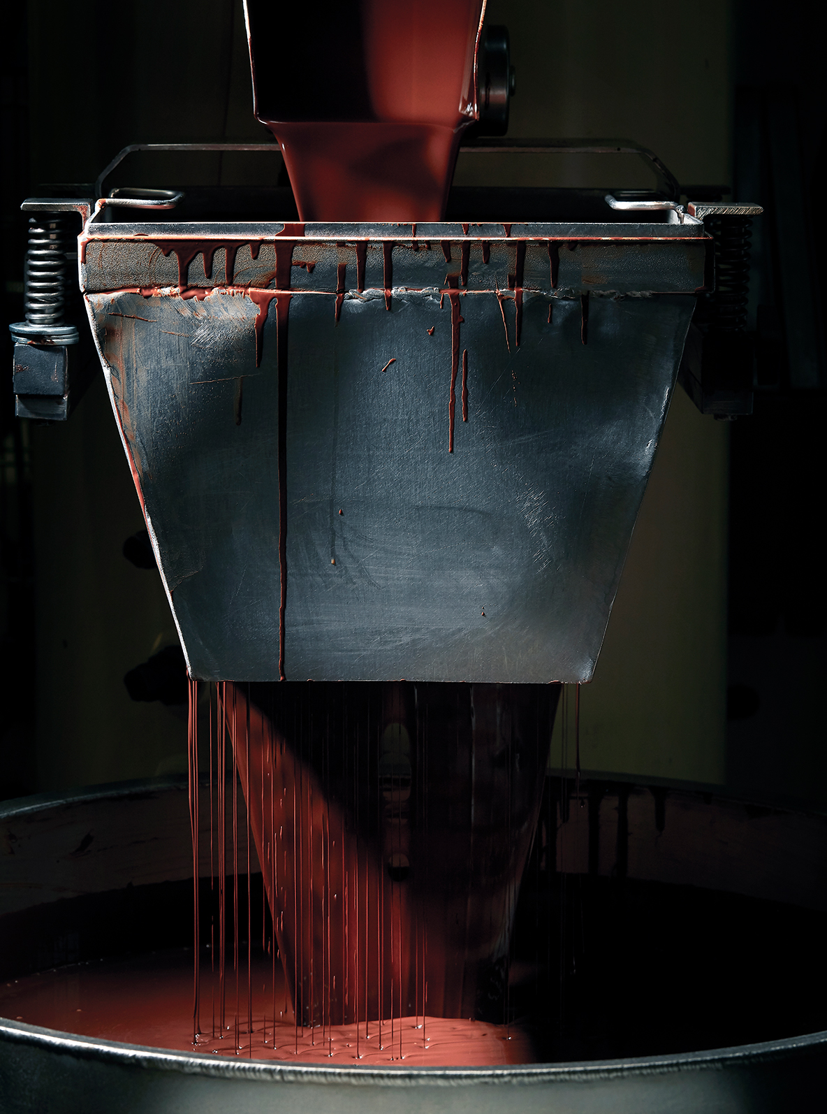
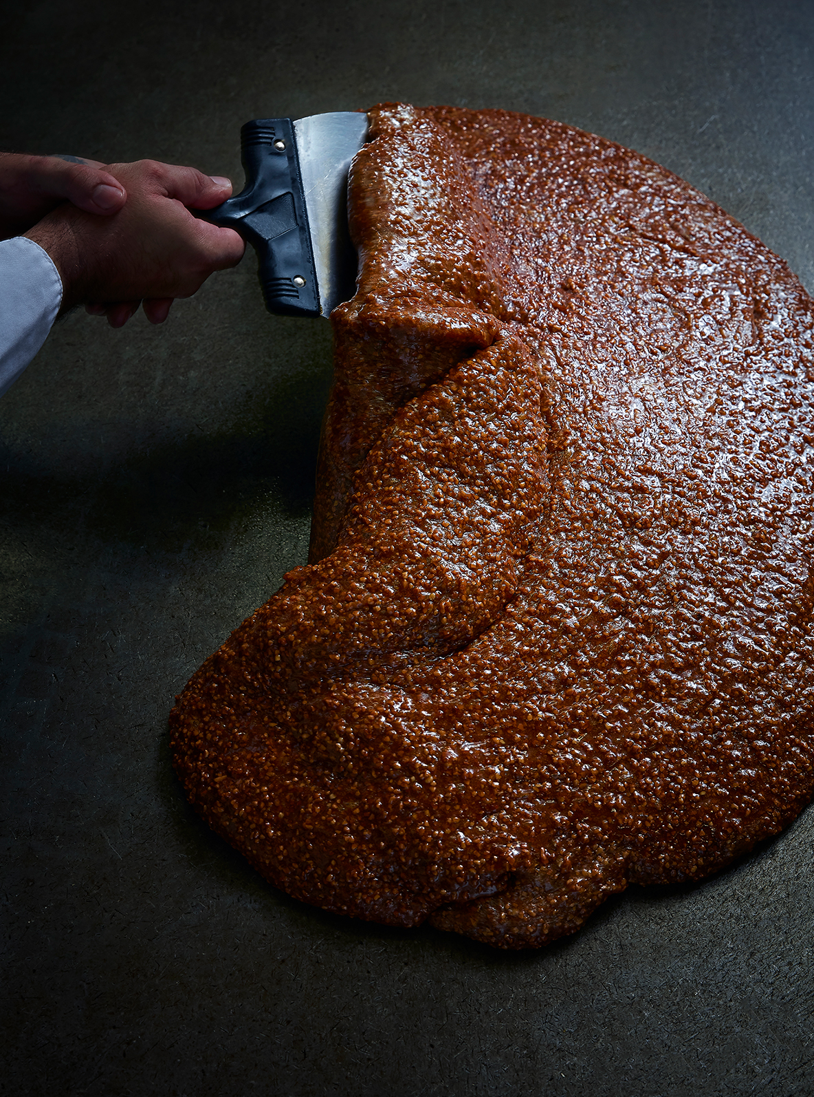
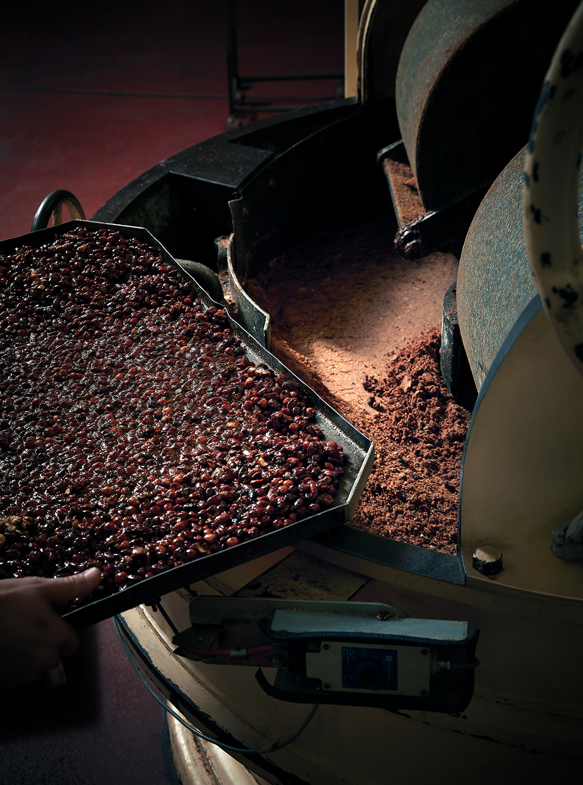
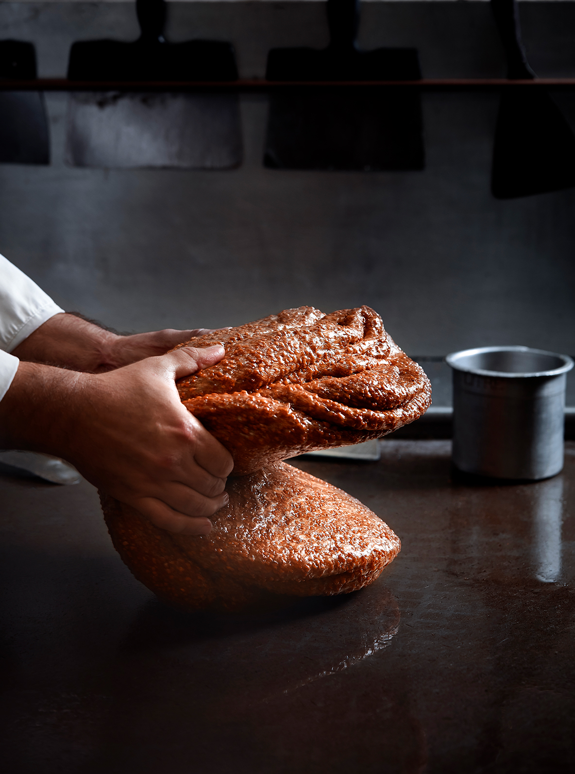
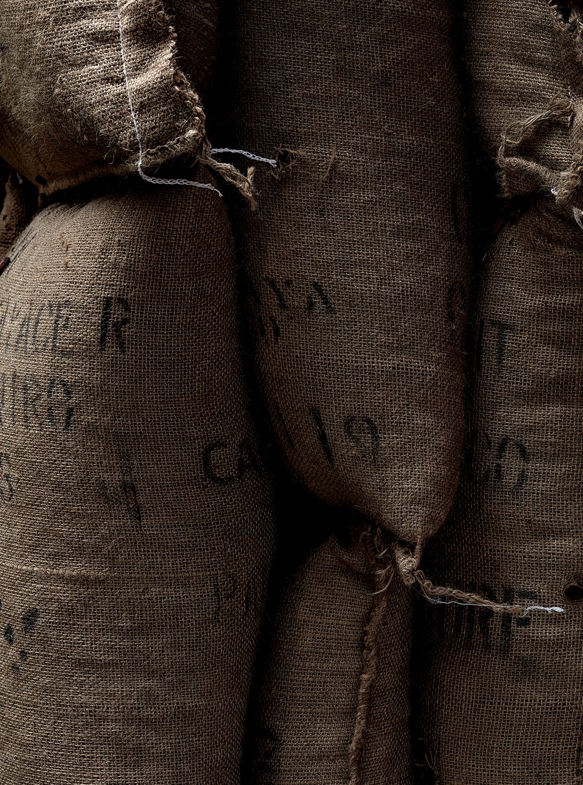
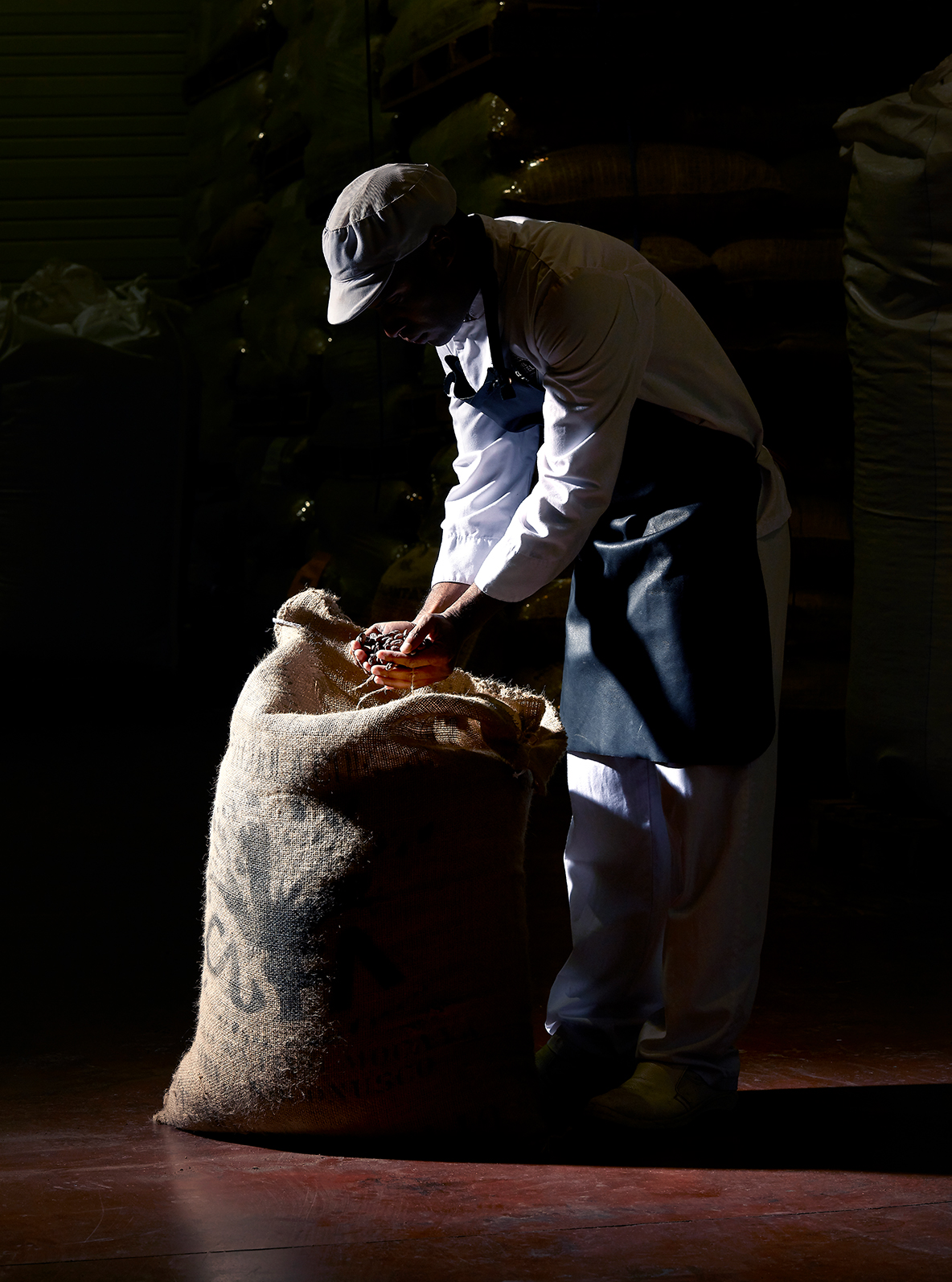
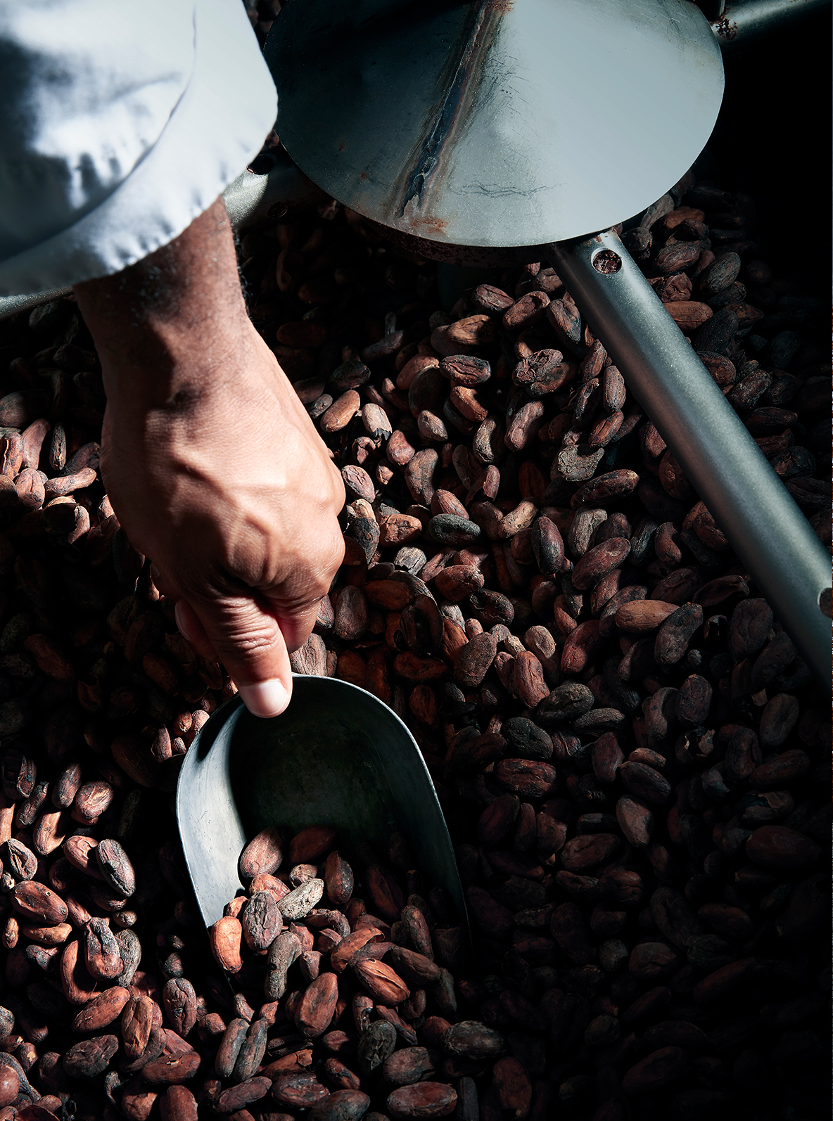
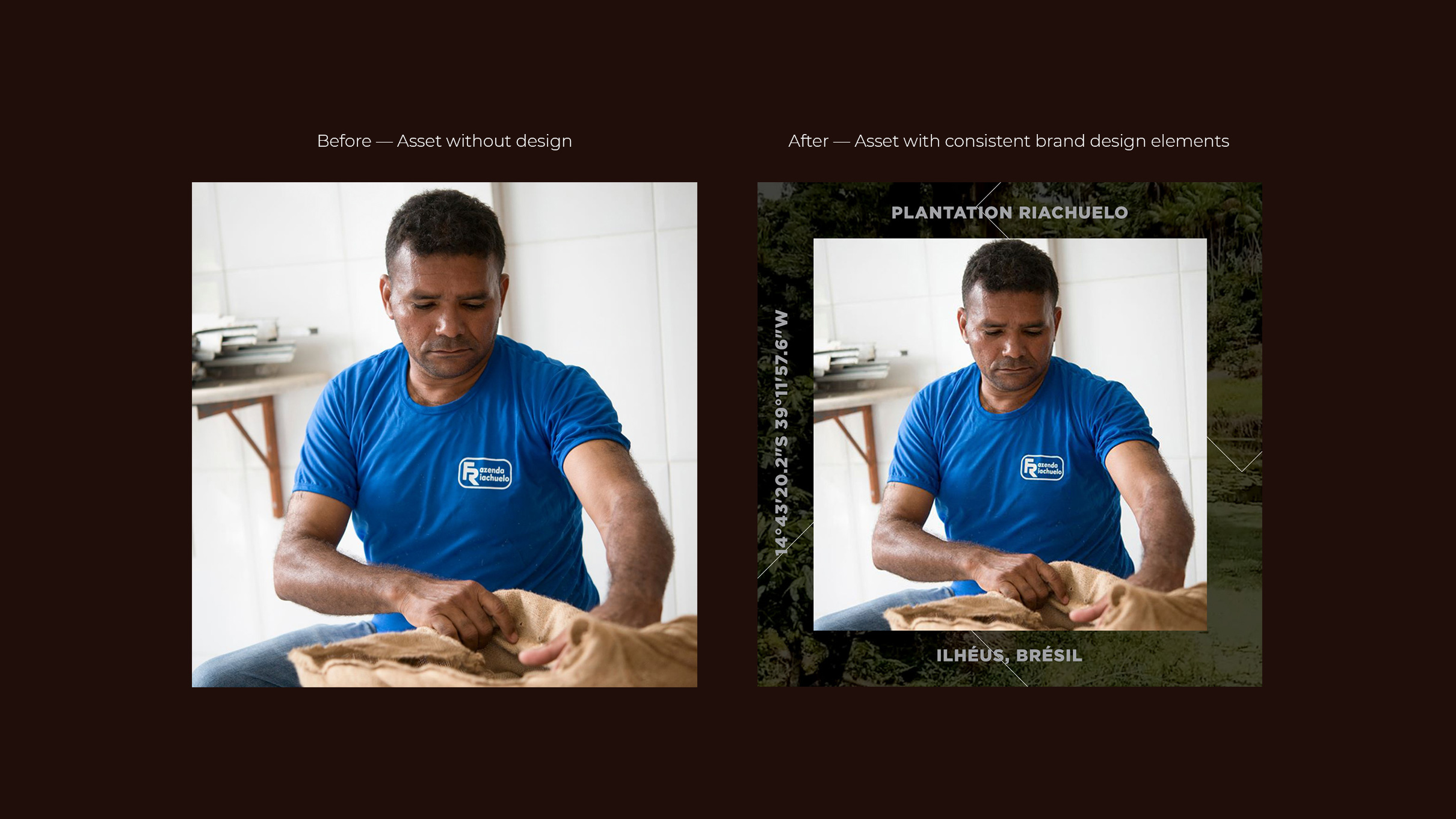
Capturing the artisanal know-how deeply rooted in passion and precision. The art direction sets a tone that is sophisticated, elegant, and bold, elevating the visual narrative with a premium feel, even when set against the backdrop of conventional factory settings. Through a modern aesthetic, the portrayal aims to leave consumers with a distinct impression – a premium brand that's crafted with care by a manufacturer with a rich and respected heritage.
Brand guidelines for social
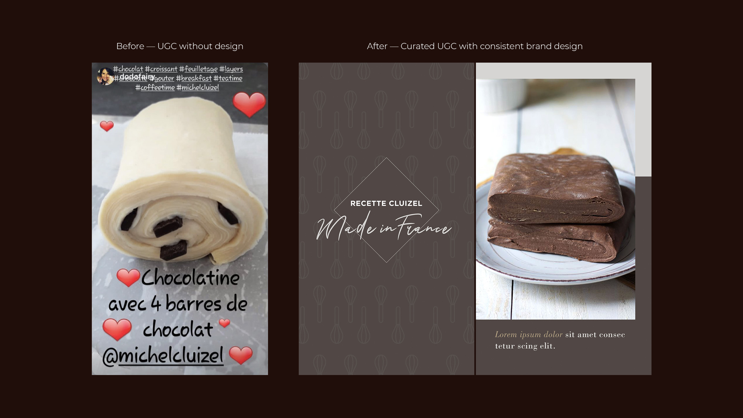
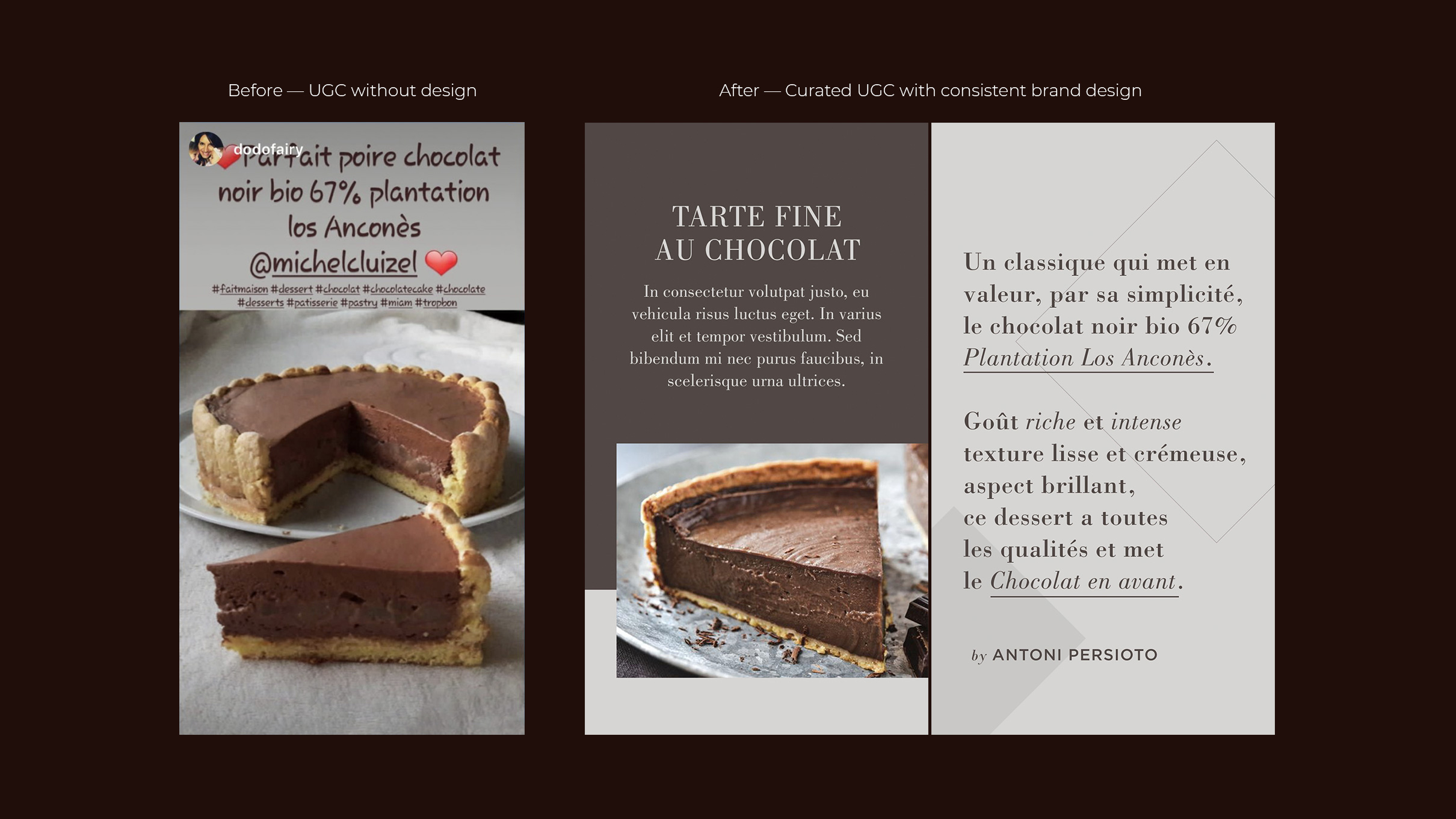
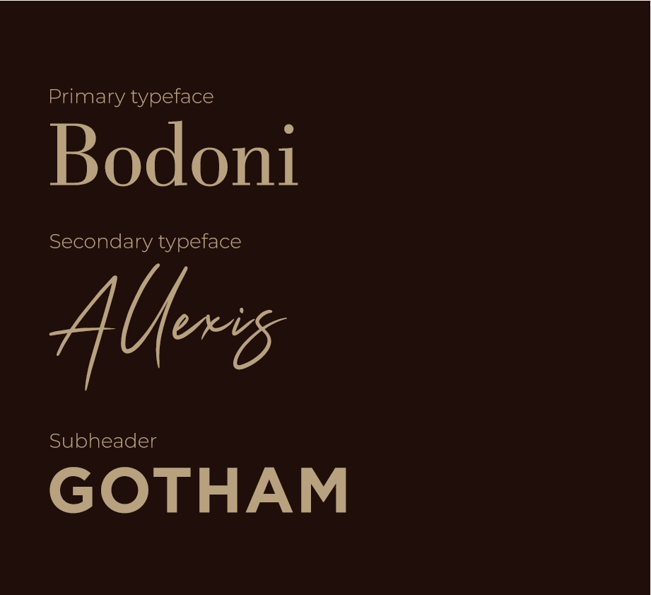
Two typefaces are used to ensure flexibility and diversity: a serif font paired with an elegant script, harmonized with a geometric sans-serif that combines tradition and modern elegance. The color palette draws inspiration from rich chocolate hues and the colors of Paris, using darker tones to evoke a sense of boldness and sophistication.

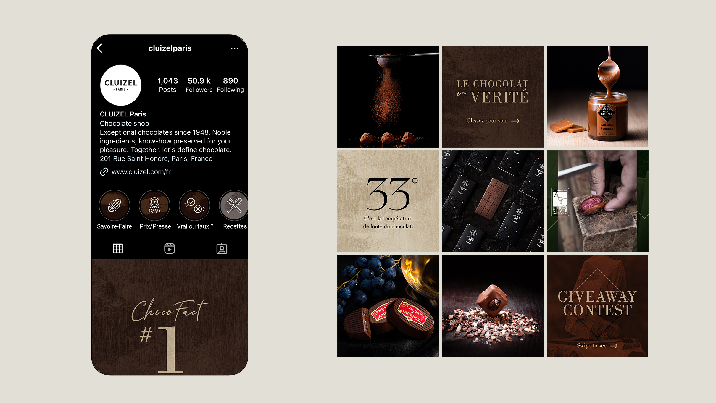
Graphic system
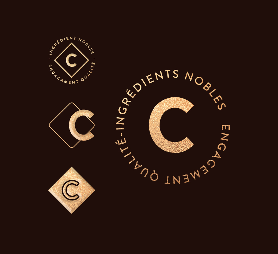
The diamond shape has been repurposed into a versatile and iconic graphic element. It supports text and highlights imagery, reinforcing the brand's boldness, distinctiveness and heritage.
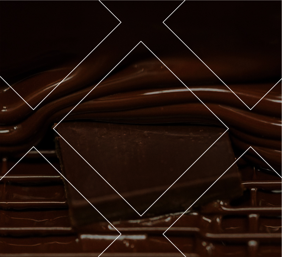
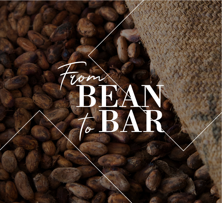
Typeface pairings and graphic applications
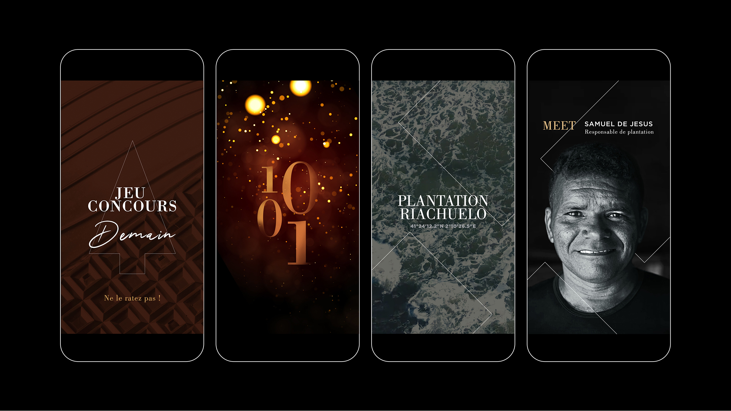
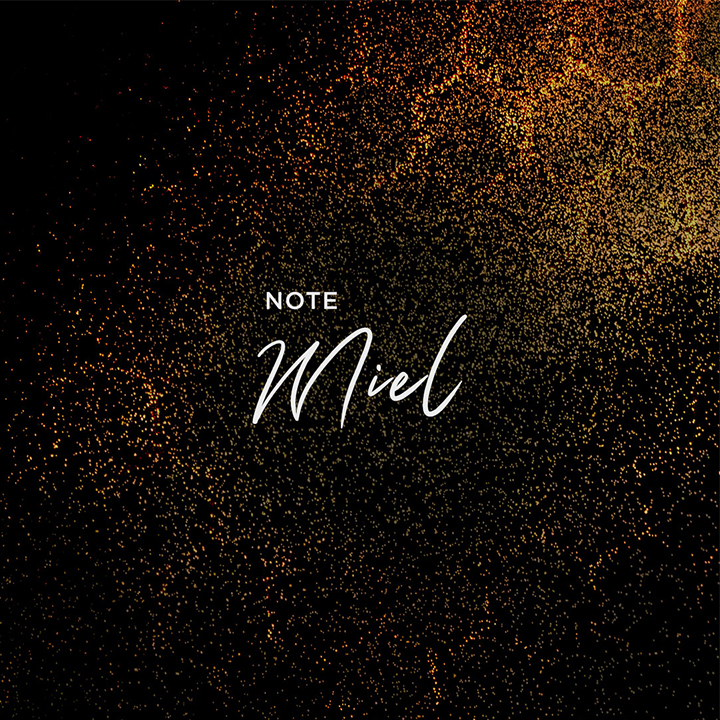
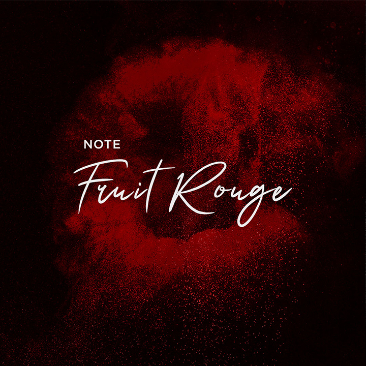
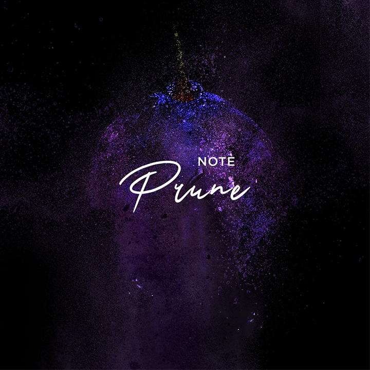
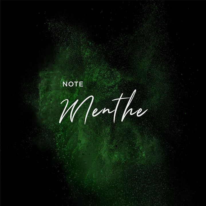
Graphic system with darker color tones tailored to highlight flavors and tasting notes

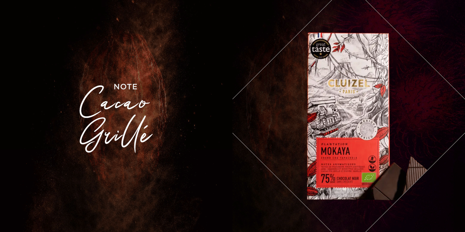
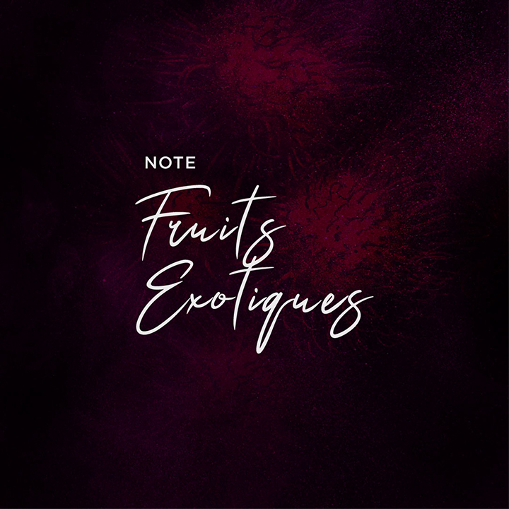
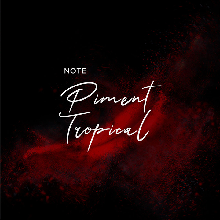
Before — Social grid
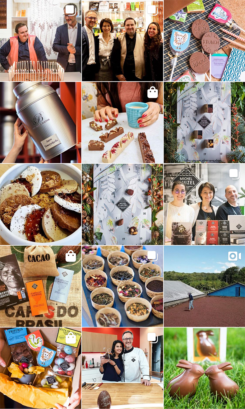
After — Social grid
Photographers
Atelier Mai 98
Angela di Paolo
Linda Lam
Project Team — Doer
Pauline Picca
Camille Rostoucher
Yohan Greck
Julien Veillon
